
Case study · Natural-hair care
Jas Hair
Jas Hair makes plant-based care for natural and curly hair in Maryland, USA. The products were ready, in unlabelled off-the-shelf containers. We designed the mark and its family, one label system for three products and three formats, and built every container in 3D, so the brand had its launch images before the first label was printed.
- Sector
- Beauty, natural-hair care
- Scope
- Logo family, guidelines, labels, 3D product images, launch posts
- Year
- 2025
- Format
- 14 boards
Select any board to open it at full size.
Each board is followed by its text, easy to read on a phone.
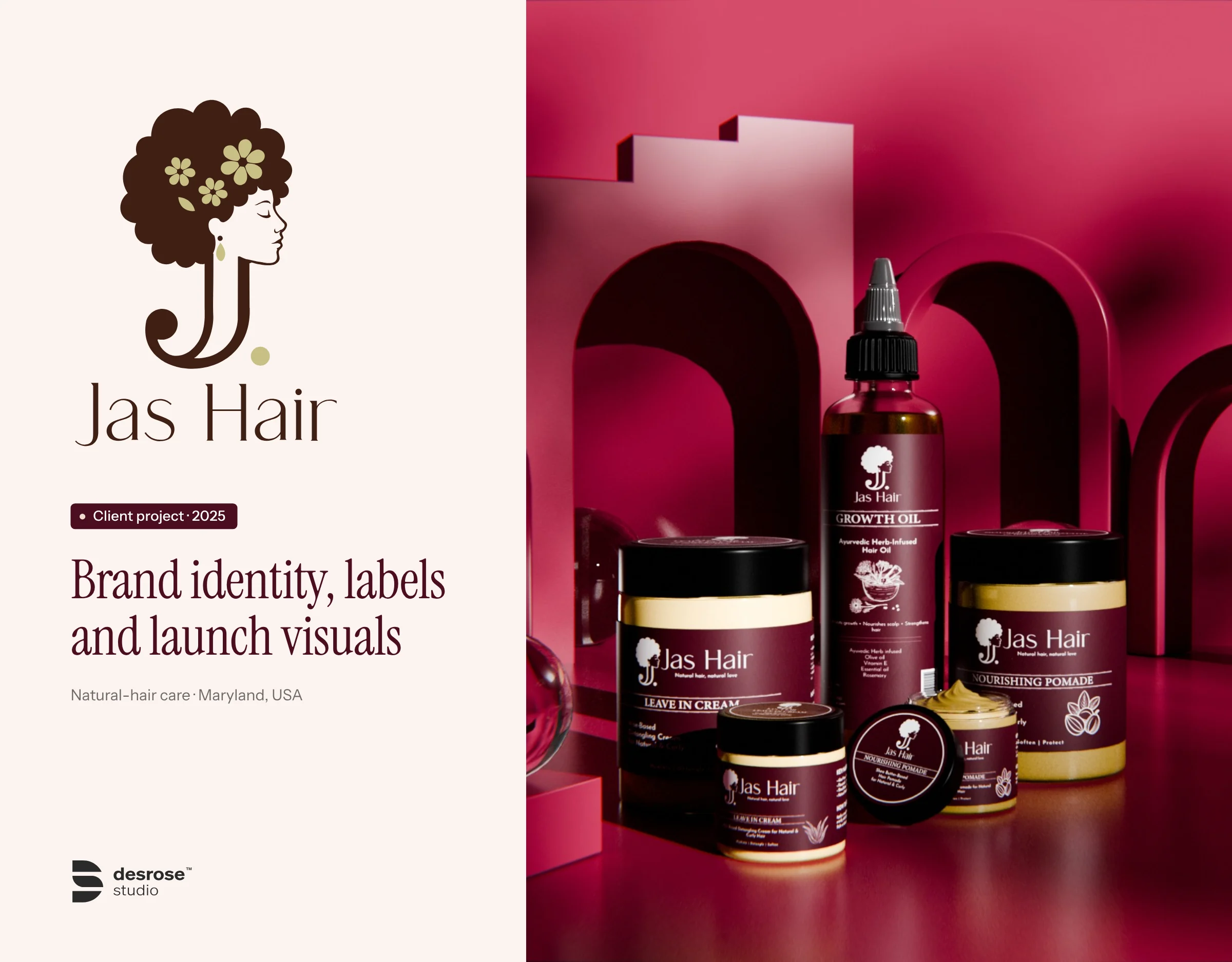
Jas Hair
Brand identity, labels and launch visuals for a natural-hair care brand from Maryland, USA. 2025.
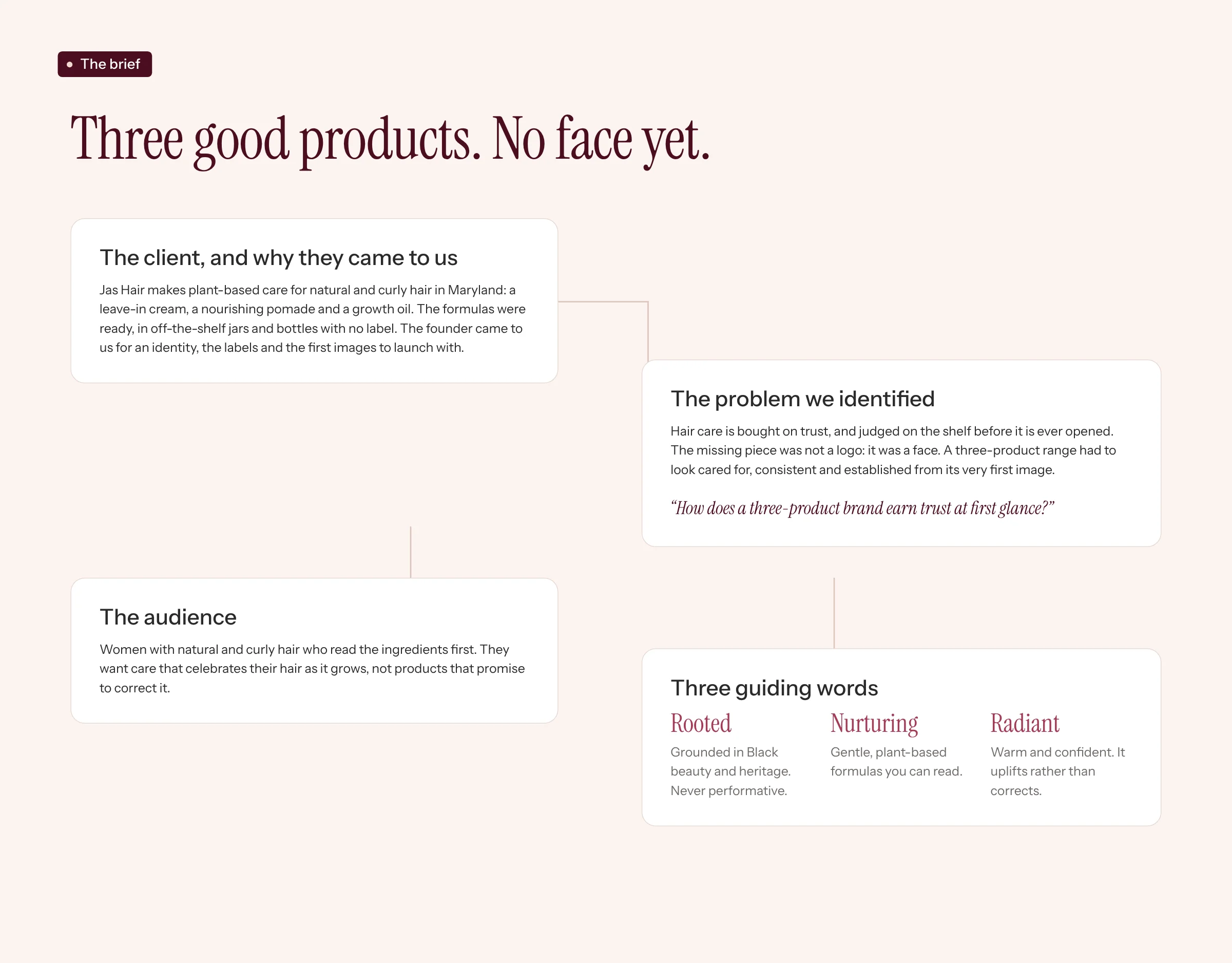
Three good products. No face yet.
The client, and why they came to us. Jas Hair makes plant-based care for natural and curly hair in Maryland: a leave-in cream, a nourishing pomade and a growth oil. The formulas were ready, in off-the-shelf jars and bottles with no label. The founder came to us for an identity, the labels and the first images to launch with.
The problem we identified. Hair care is bought on trust, and judged on the shelf before it is ever opened. The missing piece was not a logo: it was a face. A three-product range had to look cared for, consistent and established from its very first image.
“How does a three-product brand earn trust at first glance?”
The audience. Women with natural and curly hair who read the ingredients first. They want care that celebrates their hair as it grows, not products that promise to correct it.
- Rooted: grounded in Black beauty and heritage. Never performative.
- Nurturing: gentle, plant-based formulas you can read.
- Radiant: warm and confident. It uplifts rather than corrects.
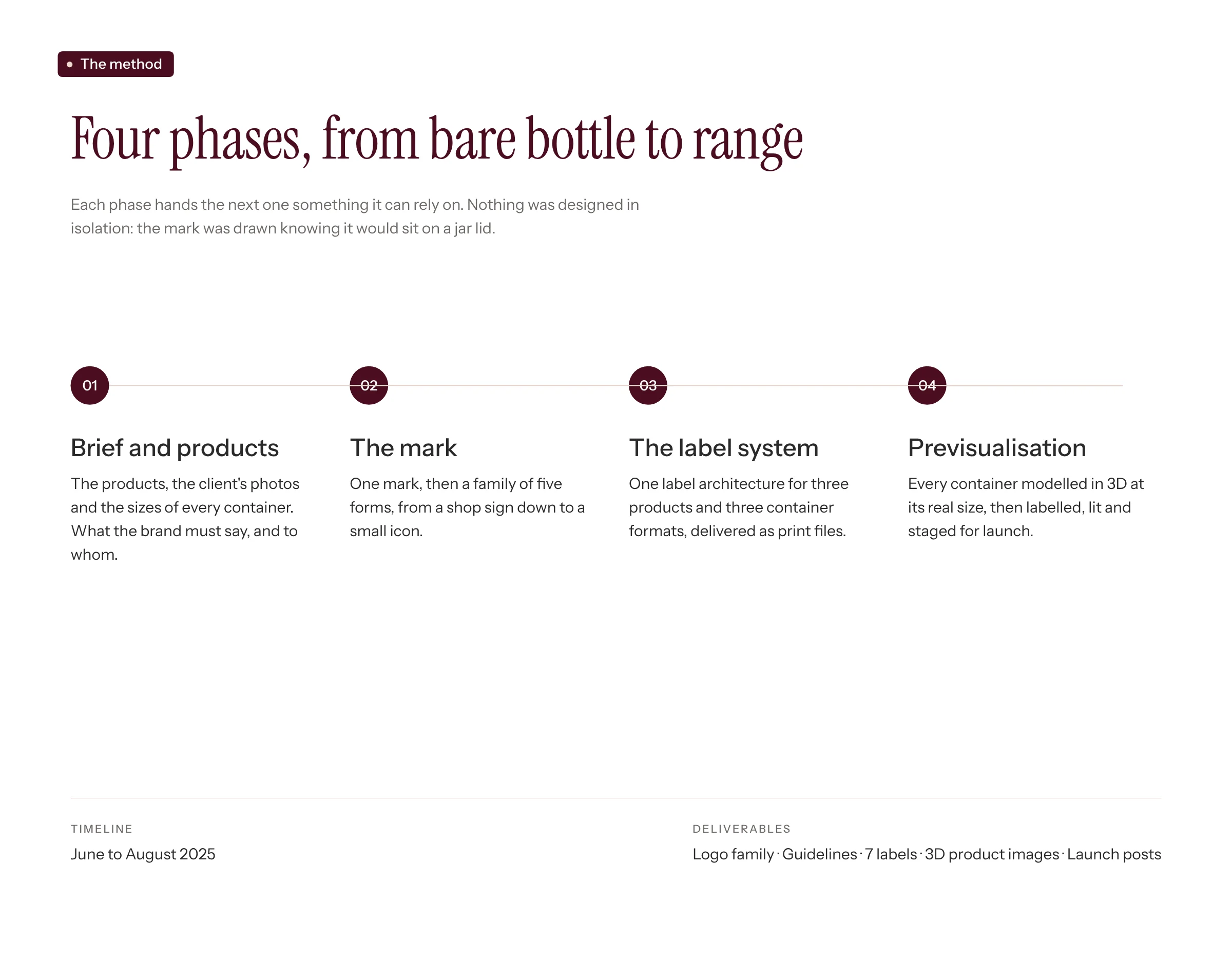
Four phases, from bare bottle to range
Each phase hands the next one something it can rely on. Nothing was designed in isolation: the mark was drawn knowing it would sit on a jar lid.
- Brief and products: the products, the client's photos and the sizes of every container. What the brand must say, and to whom.
- The mark: one mark, then a family of five forms, from a shop sign down to a small icon.
- The label system: one label architecture for three products and three container formats, delivered as print files.
- Previsualisation: every container modelled in 3D at its real size, then labelled, lit and staged for launch.
Timeline: June to August 2025. Deliverables: logo family, guidelines, 7 labels, 3D product images, launch posts.
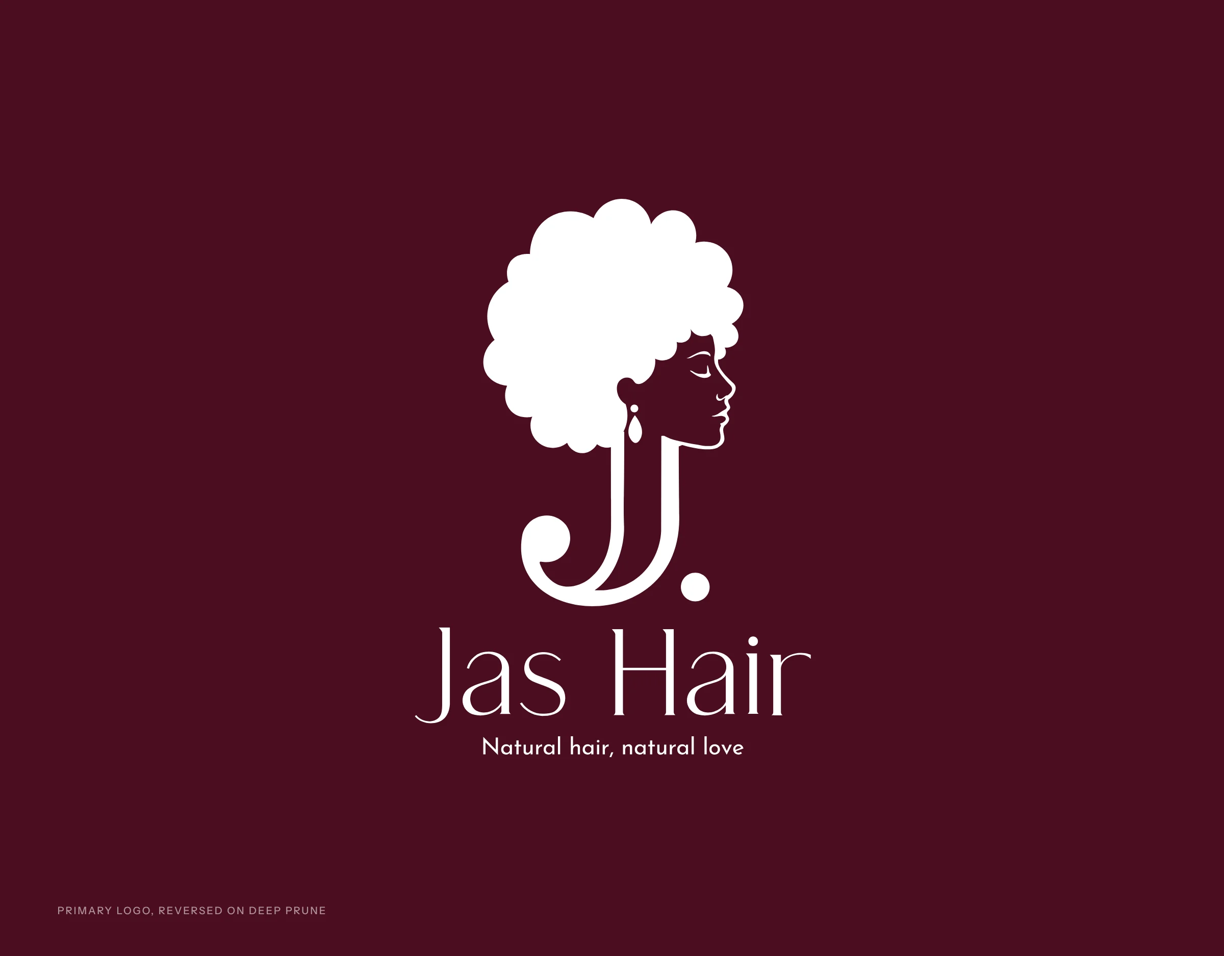
The primary logo
The stacked logo, reversed in white on Deep Prune.
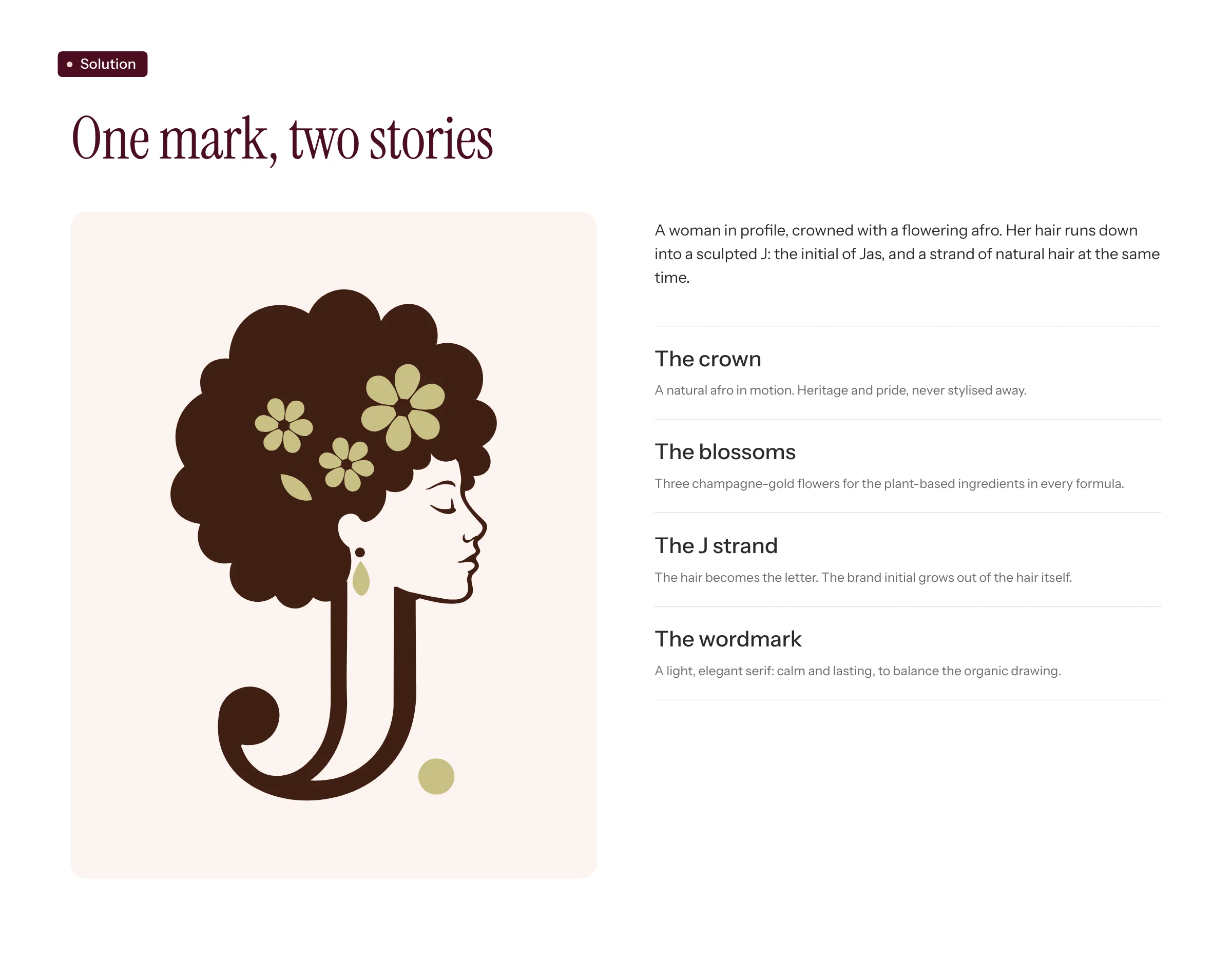
One mark, two stories
A woman in profile, crowned with a flowering afro. Her hair runs down into a sculpted J: the initial of Jas, and a strand of natural hair at the same time.
- The crown: a natural afro in motion. Heritage and pride, never stylised away.
- The blossoms: three champagne-gold flowers for the plant-based ingredients in every formula.
- The J strand: the hair becomes the letter. The brand initial grows out of the hair itself.
- The wordmark: a light, elegant serif, calm and lasting, to balance the organic drawing.
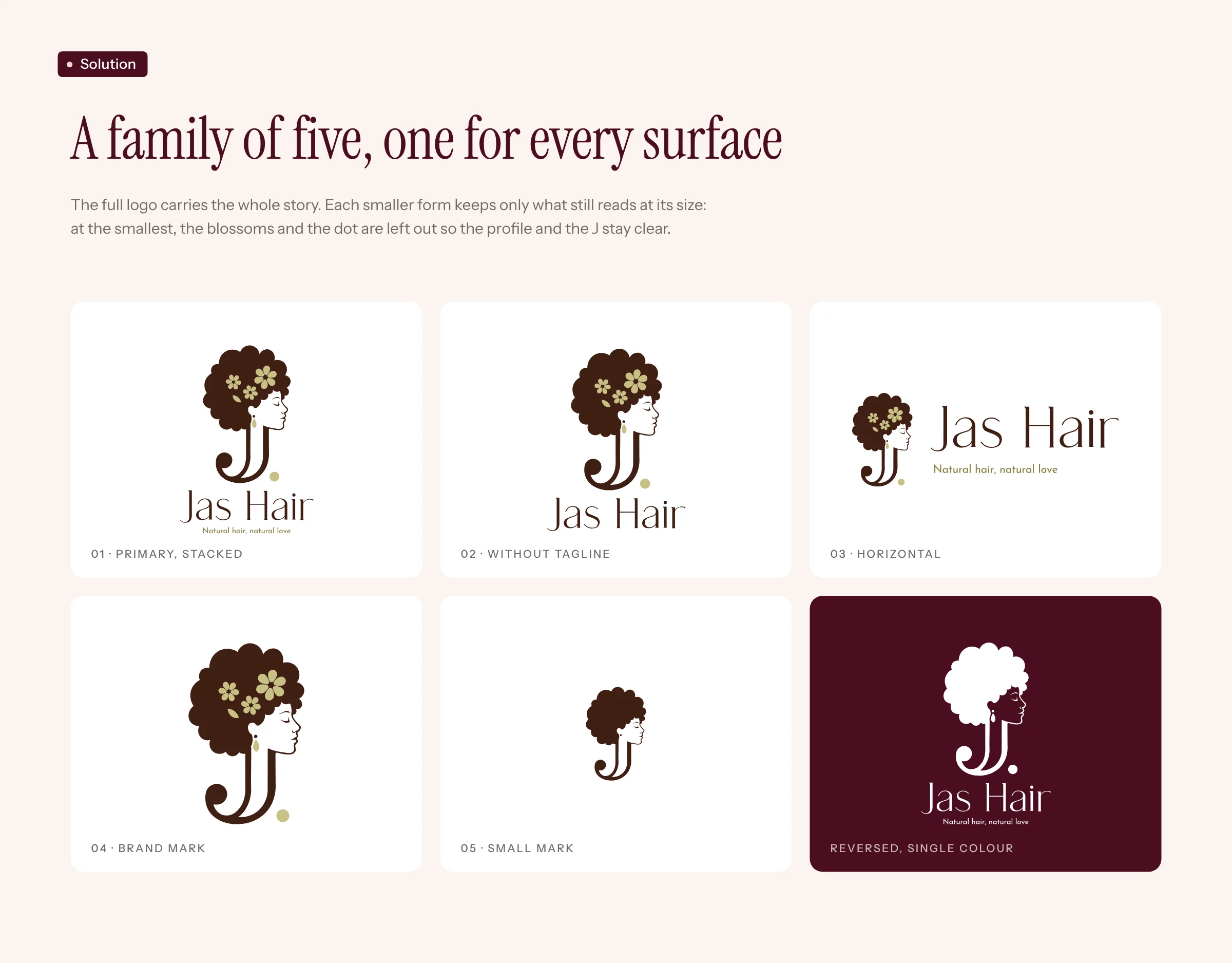
A family of five, one for every surface
The full logo carries the whole story. Each smaller form keeps only what still reads at its size: at the smallest, the blossoms and the dot are left out so the profile and the J stay clear.
- Primary, stacked
- Without tagline
- Horizontal
- Brand mark
- Small mark
- Reversed, single colour
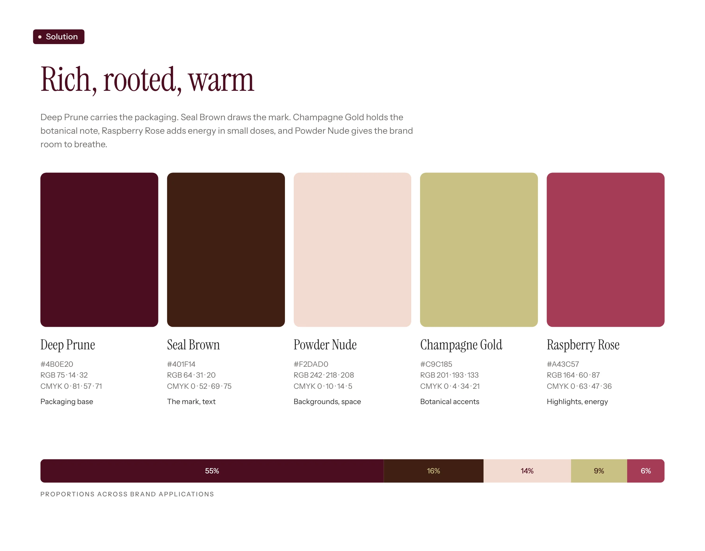
Rich, rooted, warm
Deep Prune carries the packaging. Seal Brown draws the mark. Champagne Gold holds the botanical note, Raspberry Rose adds energy in small doses, and Powder Nude gives the brand room to breathe.
- Deep Prune #4B0E20: packaging base, about 55% of the brand's surfaces.
- Seal Brown #401F14: the mark and text, about 16%.
- Powder Nude #F2DAD0: backgrounds and space, about 14%.
- Champagne Gold #C9C185: botanical accents, about 9%.
- Raspberry Rose #A43C57: highlights and energy, about 6%.
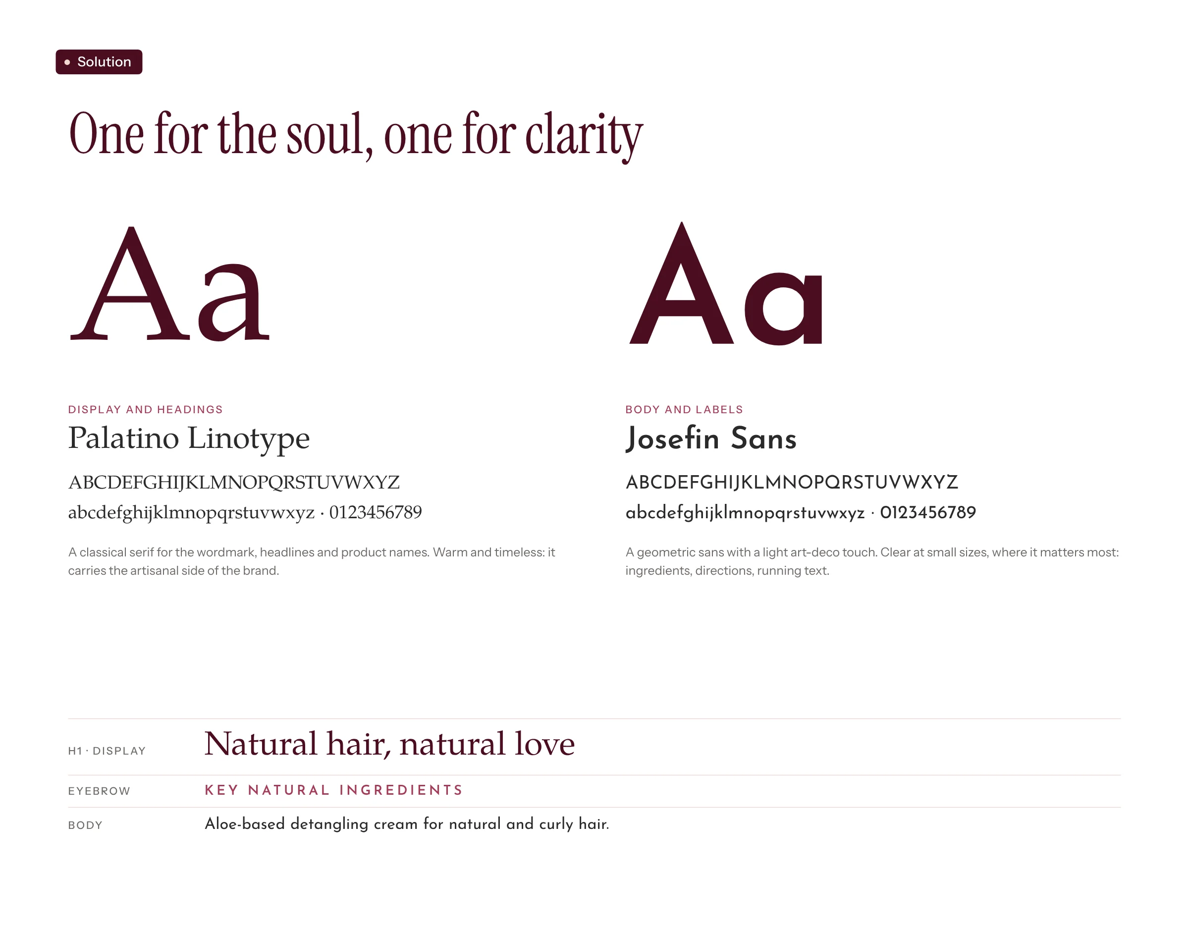
One for the soul, one for clarity
Palatino Linotype, for display and headings: a classical serif for the wordmark, headlines and product names. Warm and timeless, it carries the artisanal side of the brand.
Josefin Sans, for body and labels: a geometric sans with a light art-deco touch. Clear at small sizes, where it matters most: ingredients, directions, running text.
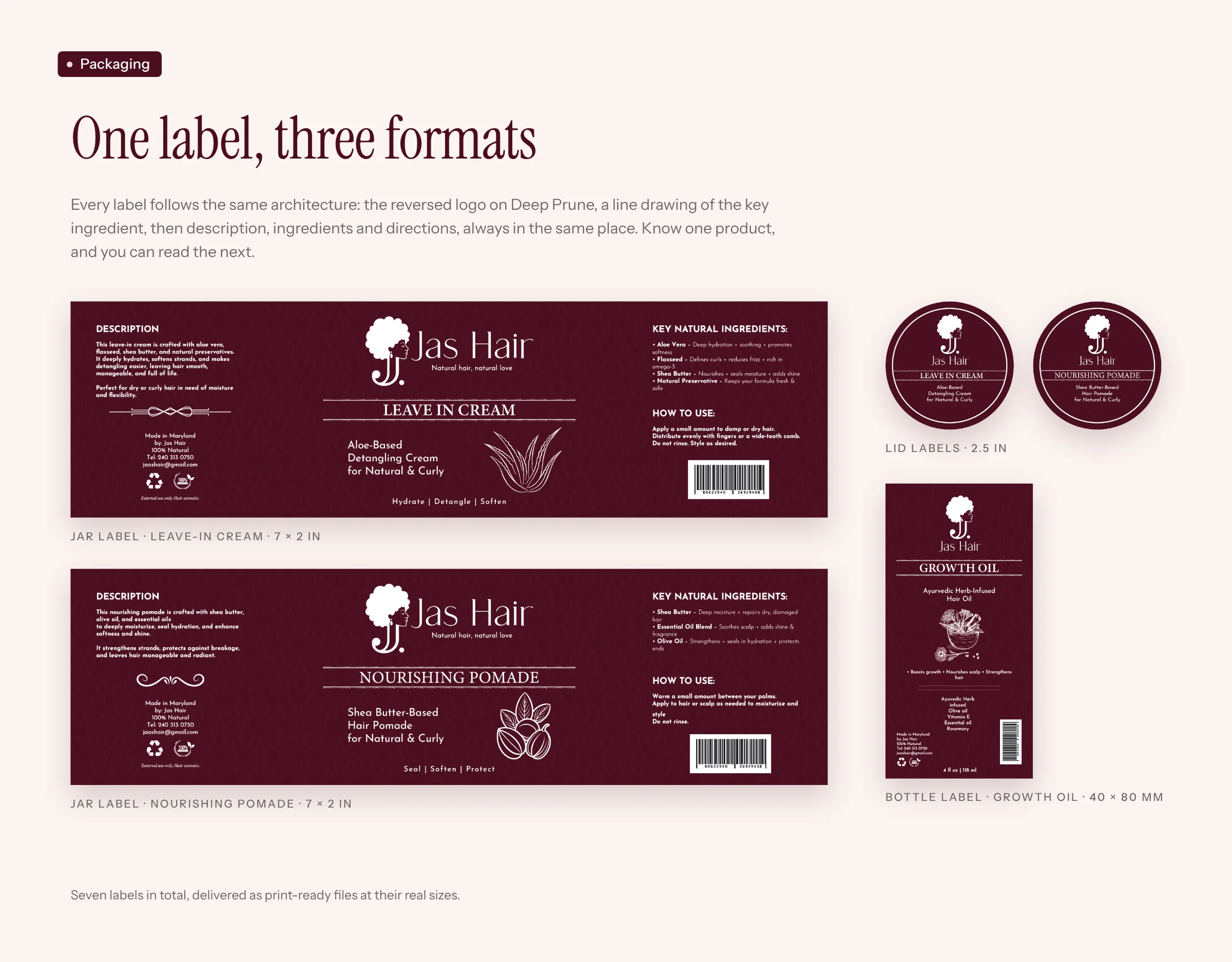
One label, three formats
Every label follows the same architecture: the reversed logo on Deep Prune, a line drawing of the key ingredient, then description, ingredients and directions, always in the same place. Know one product, and you can read the next.
- Jar labels, Leave-In Cream and Nourishing Pomade: 7 × 2 in.
- Lid labels: 2.5 in.
- Bottle label, Growth Oil: 40 × 80 mm.
Seven labels in total, delivered as print-ready files at their real sizes.
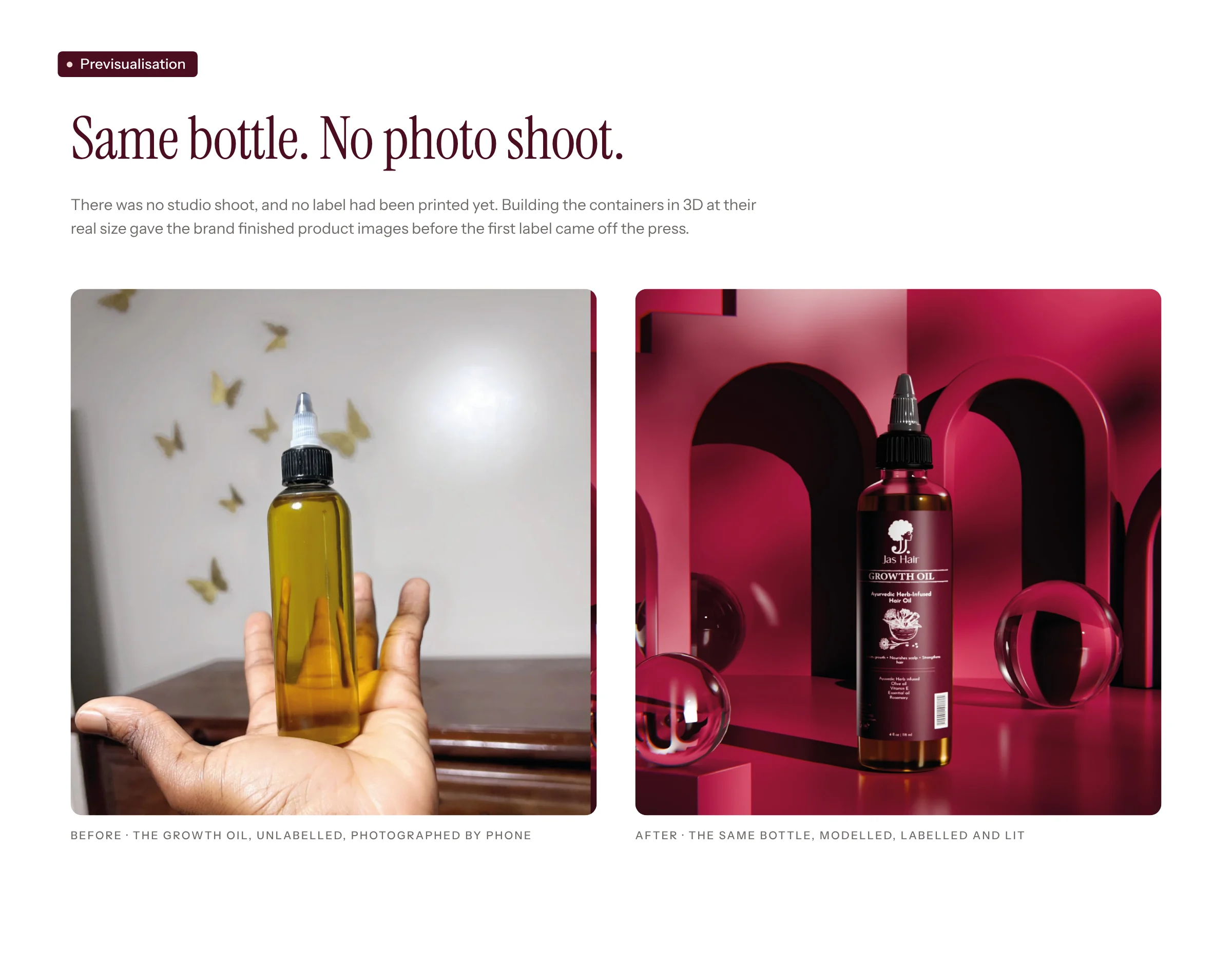
Same bottle. No photo shoot.
There was no studio shoot, and no label had been printed yet. Building the containers in 3D at their real size gave the brand finished product images before the first label came off the press.
Before: the growth oil, unlabelled, photographed by phone. After: the same bottle, modelled, labelled and lit.
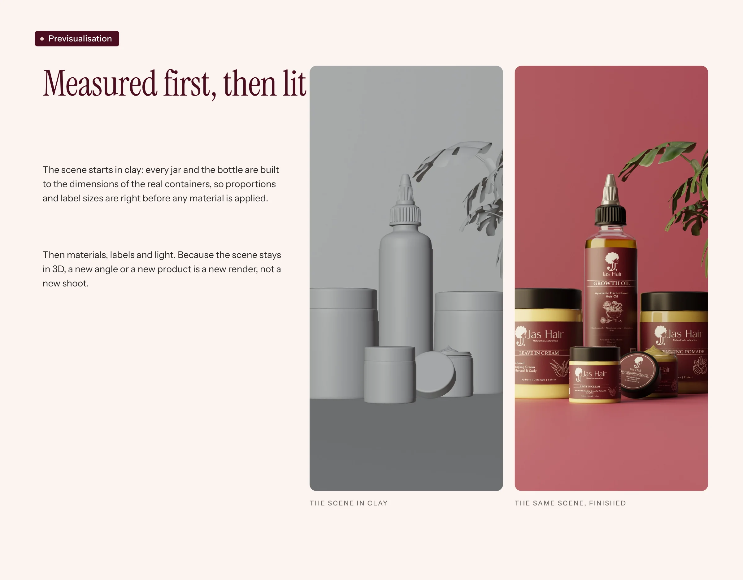
Measured first, then lit
The scene starts in clay: every jar and the bottle are built to the dimensions of the real containers, so proportions and label sizes are right before any material is applied.
Then materials, labels and light. Because the scene stays in 3D, a new angle or a new product is a new render, not a new shoot.
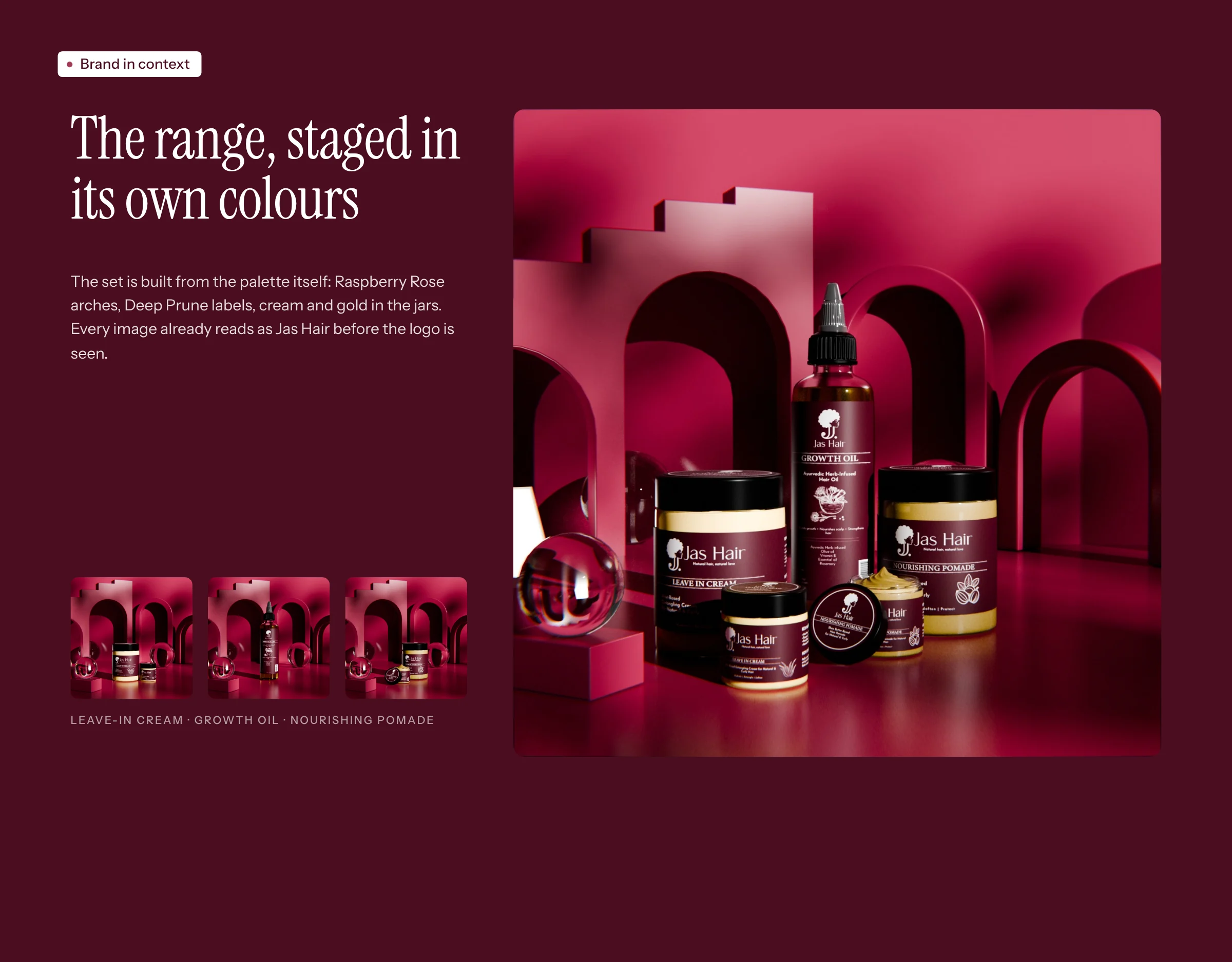
The range, staged in its own colours
The set is built from the palette itself: Raspberry Rose arches, Deep Prune labels, cream and gold in the jars. Every image already reads as Jas Hair before the logo is seen.
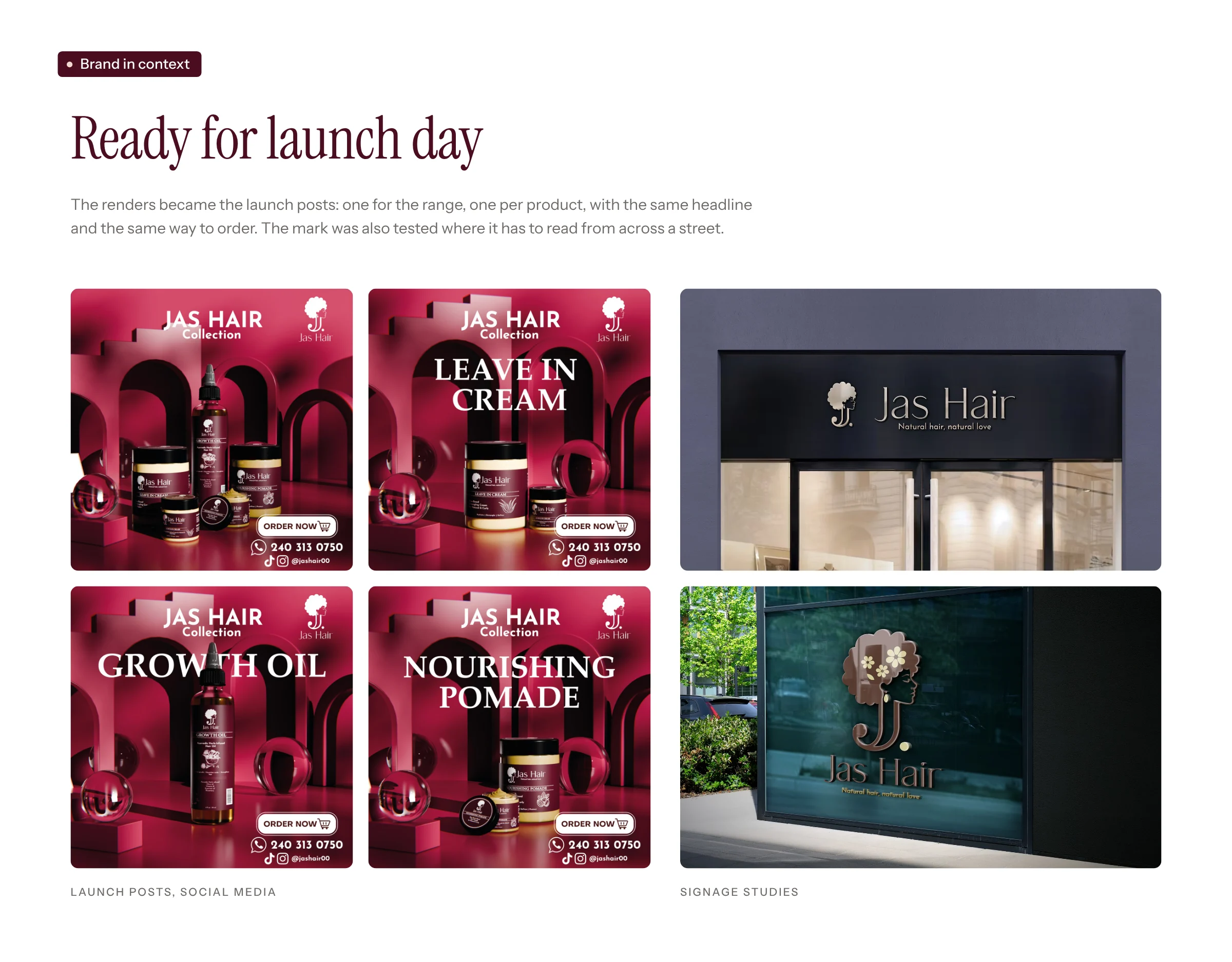
Ready for launch day
The renders became the launch posts: one for the range, one per product, with the same headline and the same way to order. The mark was also tested where it has to read from across a street.
A clear idea, carried all the way
“Everything was clear and precise. You asked me what I wanted and did everything possible to give it to me. The deadline was respected. I am happy and satisfied.”
Client, Jas Hair.
A brand does not start with a big budget. It starts with a clear idea, carried the same way from the mark to the label to the first image. That is what Desrose Studio brings to every project.